Details
Description
Here are some suggestions on the main page (http://dennisdawson.github.io/):
1. In the skinny bones' demo: http://mmistakes.github.io/skinny-bones-jekyll/ , the main banner is extended to the edge of the page. Can we do the same thing in our main page, and stretch rs_banner.png to the edge?
2. Can we add two buttons in the main banner as that in the demo page? eg. add "Get the Quickstart VM" button and "View on Github" button.
3. The four sections in the main page (Column-level security, Storage Agnostic Clients, Impala Quality Performance and Try it now) should be aligned to the center.
We can remove "Try it now" section, if we create the "Get the Quickstart VM button" button in the banner. Also it is better to arrange these three sections' titles in one row.
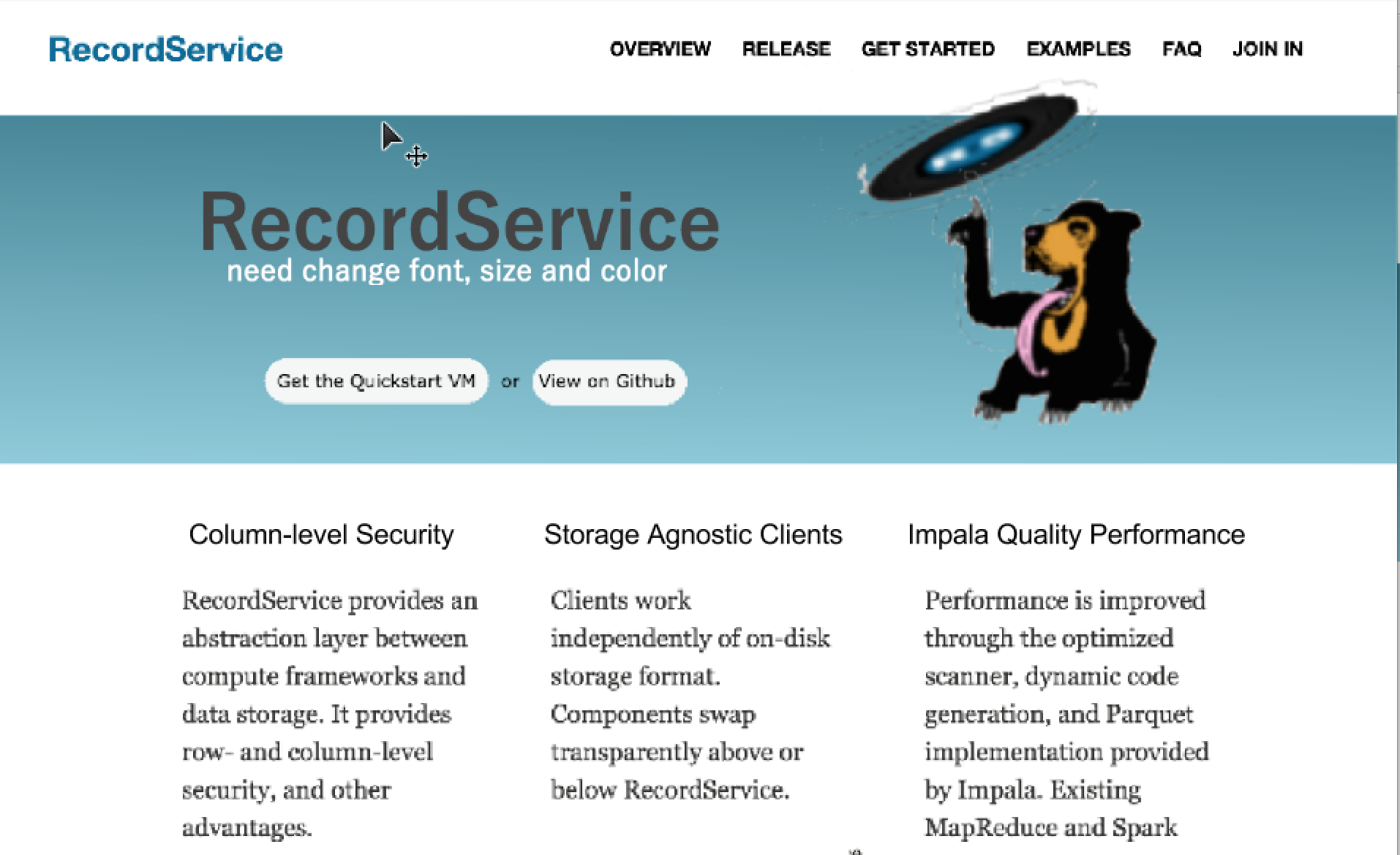
4. Move the sunbear image to the main banner.
I attached a sample graph for the main page. As it is just a draft graph, you can update the font, size, color, composition and background image as you like.